Truly Tasteless Tees
A niche e-commerce brand selling edgy, funny, and sometimes shocking custom t-shirts
View Site
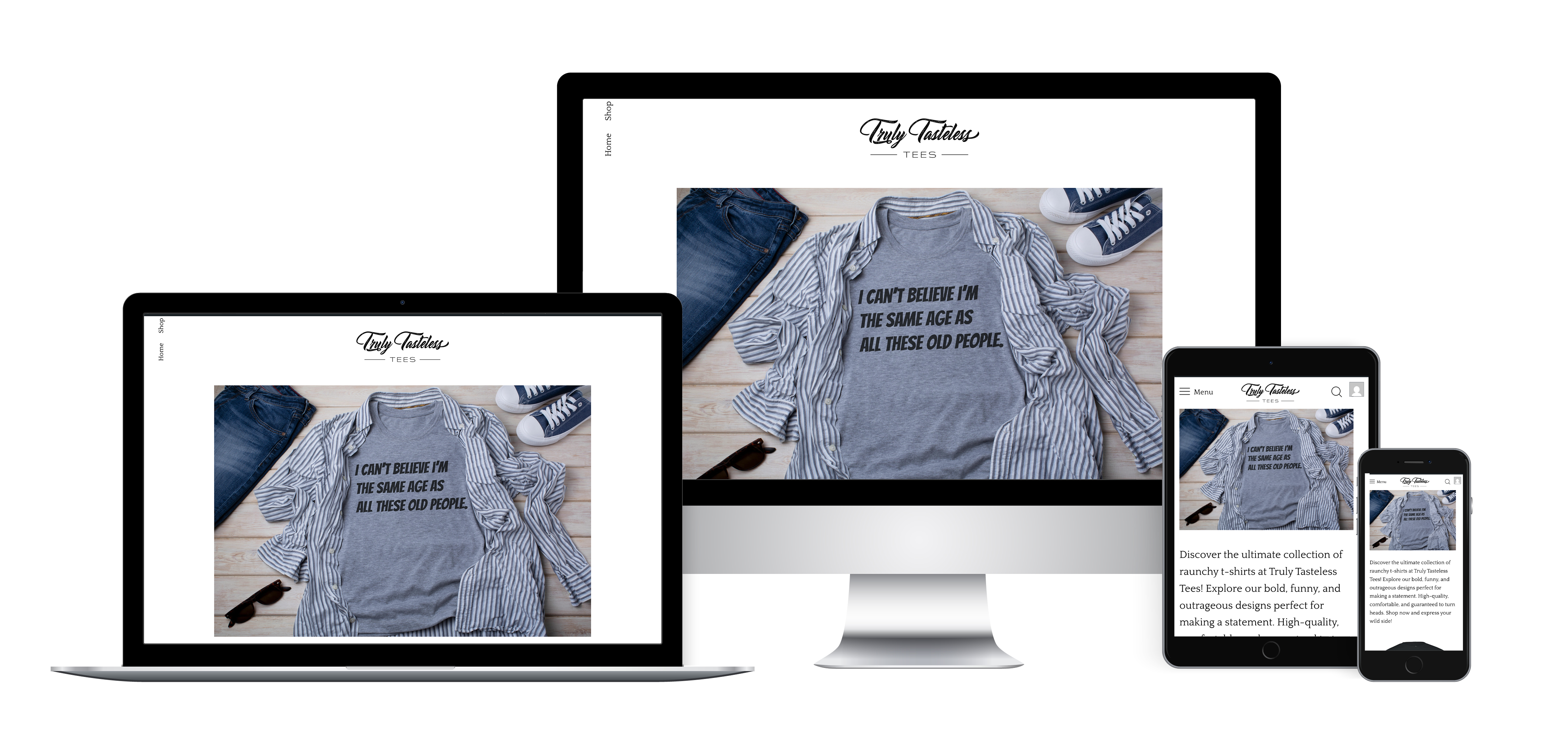
A niche e-commerce brand selling edgy, funny, and sometimes shocking custom t-shirts

The Problem: While the brand had strong social engagement, sales conversions on its website were underwhelming.
Challenge: Improve the e-commerce experience to increase conversions and reduce bounce rate, especially on mobile.
Goals
My Role: As the lead UX designer on this initiative, I:
Hueristic Review
I conducted a heuristic evaluation of the original site and found the following issues:
User Interviews & Surveys
10 customer interviews revealed:
Analytics Deep Dive
We took a Lean UX approach—design, test, iterate quickly. Key priorities:
Navigation & Discovery
Product Pages
Checkout
| Metric | Before | After Redesign |
|---|---|---|
| Conversion Rate | 25% | 50% |
| Bounce Rate | 68% | 49% |
| Avg Order Value | $23 | $35 |
| Monthly Revenue | $2,280 | $3,465 |
| Return Customer Rate | 12% | 28% |

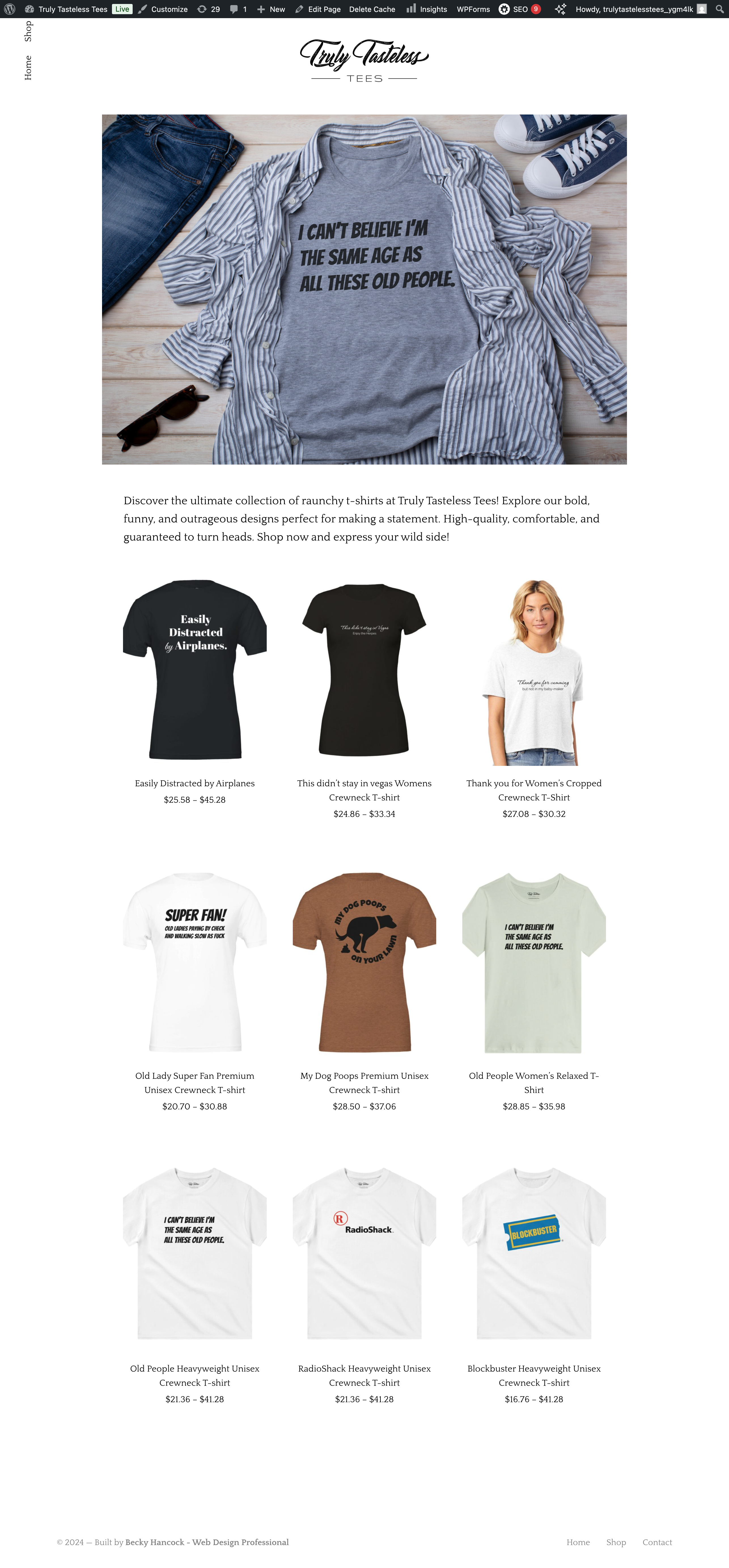

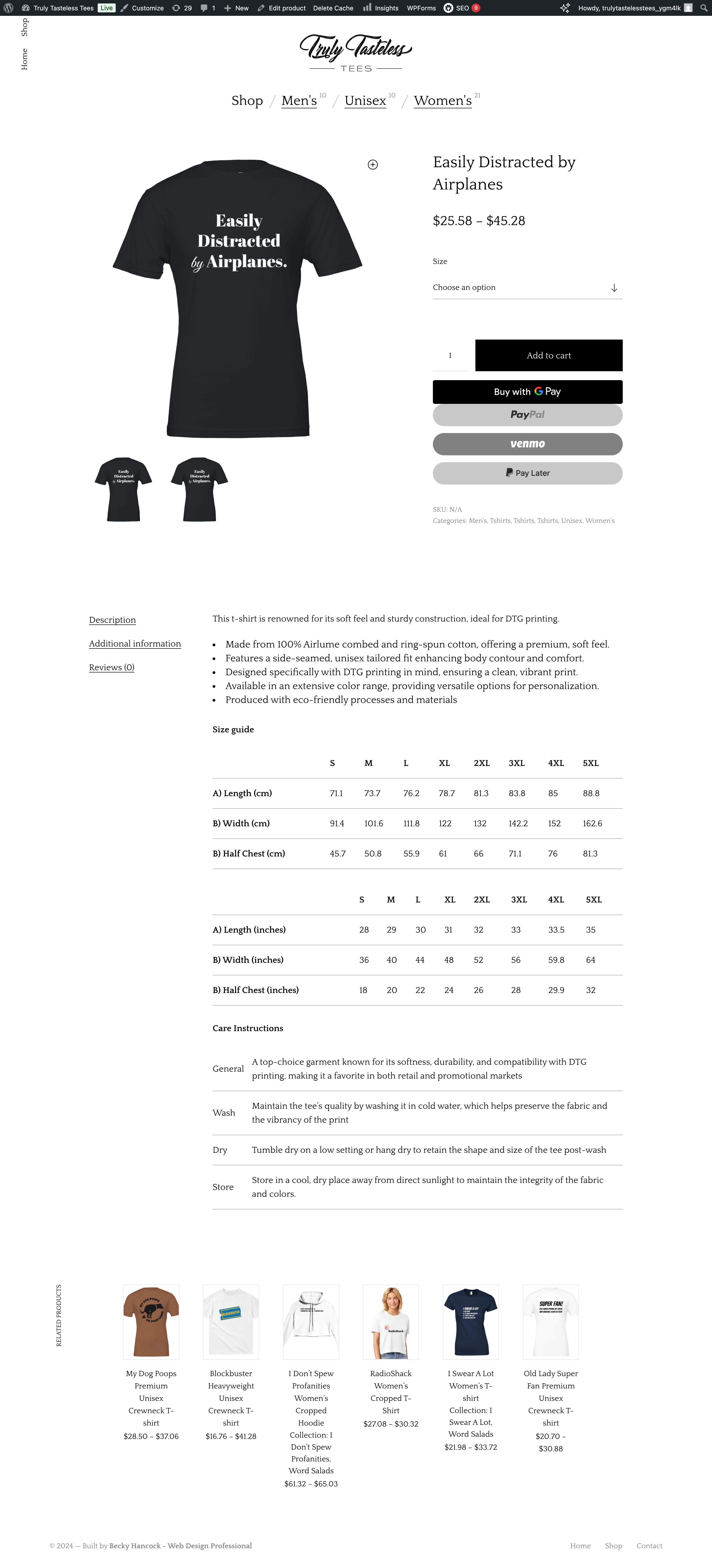

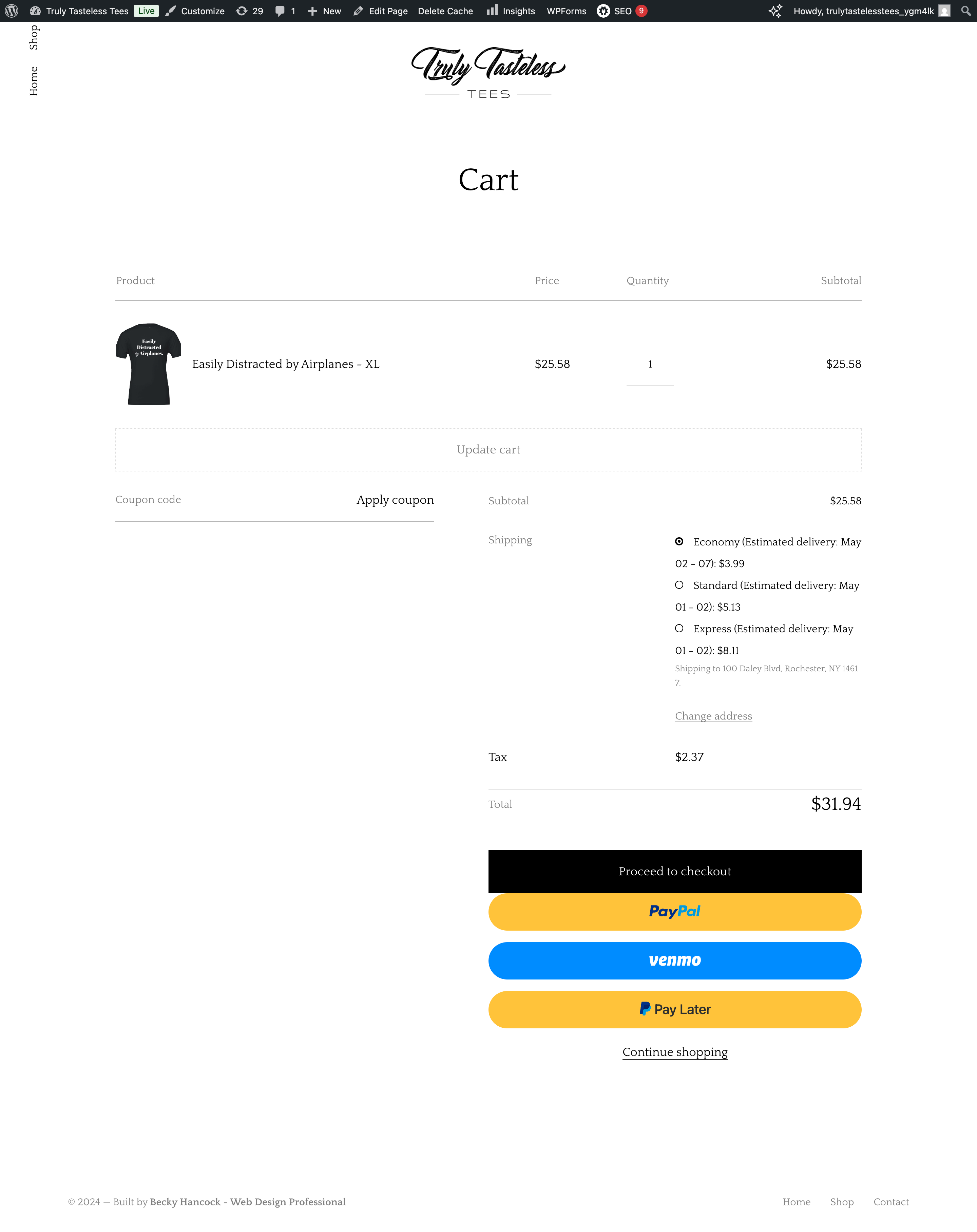
Working on Truly Tasteless Tees was a lesson in balancing personality with performance. It pushed me to create a design that was not just usable, but also true to the brand’s bold, irreverent voice.
Here’s what stood out:
Design with empathy, even for bold brands: Just because the content is edgy doesn’t mean the experience should be chaotic. Users still crave clarity, trust signals, and predictability—even when shopping for something outrageous.
Microcopy is UX’s secret weapon: Using humor intentionally in tooltips, empty states, and error messages helped preserve brand voice while improving clarity.
Analytics are your compass: Knowing where users dropped off or hesitated gave me specific, data-backed areas to improve. Design shouldn’t rely solely on instinct, especially in e-commerce.
The small things matter: A sticky CTA, an easy-to-use sizing tool, and a clear progress bar were little changes that created major impact.
This project reaffirmed my belief that UX is not just about aesthetics or usability—it’s about aligning user goals with business goals, and doing so with authenticity.